

It’s 2025, and most B2B marketing leaders are in the same boat. Tell me if this sounds familiar: under pressure to drive revenue, as cheaply as possible, and somehow make the brand look great doing it.
Which is why things are starting to get a little messy.
Because the strategies that increase conversions don’t always play nice with the visual identity your brand team has worked hard to build.
Conversion rate optimization (CRO) is supposed to help you turn more visitors into pipeline.
But what happens when the call-to-action color that converts best doesn’t match your brand palette? Or when the form layout that bumps lead volume goes against your design system?
Welcome to the tension between brand and CRO.
This isn’t a thought experiment. It’s a real challenge for B2B SaaS teams trying to hit aggressive targets with tighter budgets, where every design decision has to justify itself.
CRO gets you results. Brand keeps you consistent. And sometimes, they don’t agree.
The challenge isn’t picking a side. It’s figuring out how to get them working together.
And you’re in luck, that’s exactly what i’m here to do. We’ll start by breaking down a few key differences between the two.
CRO vs. Brand
Conversion rate optimization is focused on improving conversion rate and making sure visitors (and customers) convert when they land on your website and don’t just “bounce.”
Conversion rate should be measured as a KPI – how your site is (or isn’t) converting people can be indicative of your website’s effectiveness and performance. For example, you might have a landing page that has a significantly low conversion rate. Visitors land and don’t fill out the form to grab your lead magnet. This means you are losing potential customers.
This is where CRO comes into action.
You need to identify issues that leak visitors. There could be several reasons why visitors don’t fill and submit the form. It could be due to invisible CTA, long form, a low-value lead magnet, poor headline, etc. You need to create bounce hypotheses based on your data, and then test these hypotheses.
The data for the hypotheses can be collected via a survey, different CRO tools, behavioral analytics, web analytics, or a suite of possible online marketing analytics tools. For example, you can use heatmap and session recordings to see how visitors interact with the landing page.
After you identify that visitors, somehow, don’t know what they’re supposed to do when they land on the landing page, you’ll have to tweak the landing page based on data-driven hypothesis, run an A/B test, and see what changes increase conversion rate. A/B tests involve splitting different versions of landing pages and serving them up to website visitors to see which one converts better. The winner is the one you use or sometimes replace on your website.
When tweaking different pages of the website, you might end up creating inconsistent webpages, and that’s where it starts hurting your brand. Ninety percent of customers want to have a consistent experience with a brand across all touchpoints. And 64 percent of consumers say that shared values are the core reason why they stick with a brand and develop a relationship with it.
Change your brand value – you’ll start losing your customers in no time.
Branding is related to perception, memory, emotions, and value, while CRO deals with data and numbers. CRO doesn’t measure consumer perception and emotions – it can’t. However, what CRO does is essentially covered by the brand.
CRO is a subset of your brand. And any change in your website with an intention to improve conversion rate should follow your brand guidelines. This is how your brand will stay consistent and deliver a consistent UX across all channels.
If the CRO team is set free to tweak pages in any way they like, you might end up having inconsistent pages on your website. When done right, CRO strengthens your brand.
6 Reasons Your Conversion Rate Is Tanking
Your CTAs Aren’t Doing the Heavy Lifting
This is a great article to start with as Neil Patel first explains that even the best companies can struggle with conversion rates. After a nice boost in morale, he offers practical tips for improving conversion rates, focusing specifically on two common culprits: CTAs and an unclear value proposition. Though it may seem overly simple, he backs up each with tangible examples and ways to improve.
You Don’t Have a CRO Strategy
If you’re looking for a refresher or just a clear definition of what exactly conversion rate optimization entails, this article has got you covered. Along with five ways CRO benefits SEO and organic traffic, Moz offers some practical advice on how to approach improving your CRO through different methods.
Your Website Isn’t Up to Par
Specifically geared to ecommerce platforms, this article first explores what the typical ecommerce conversion rates should look like. From there, you’re given a thorough list of 20 reasons why visitors aren’t converting. From poor first impressions and UX to misunderstanding your audience and ineffective CTAs, this list is sure to help you identify some problem areas.
You Don’t Understand What Your Conversion Rate Should Be
WordStream dives right into the data with research from thousands of Google Ad accounts (totaling $3 billion in annual spend) to highlight what good conversion rates should really look like. This article also offers five practical steps you can take to increase landing page conversions. What’s nice about this article is that it doesn’t lose sight of the fact that the quality of your conversions still matters. It’s great to have high conversions on something like a landing page, but ultimately, if they’re the wrong target audience, it won’t help you grow your business.
You’re Ignoring the Basics
Ready to get down to brass tacks? This article serves up 13 ways to increase your conversion rates with explanations on why it’s important and how to implement it. From strengthening your CTA copy to adding countdown timers, live chat, and more, it’s a list worth looking through.
You Aren’t Taking a Scientific Approach
Conversion Sciences takes a look at eight common reasons why you may be seeing a dip in your conversion rates. This list looks at things like tracking codes that may be reporting incorrect data, site performance issues, competitor landscape, and more.
Take a page out of the Girl Scouts’ guidebook: learn what your customers want, create demand, and put in the legwork to get those conversions (chocolate never hurts, either). And if you need some help along the way, First Page is here. Our experts understand conversion rate optimization and growth marketing, so we can help you move that needle (without going door-to-door).
How CRO Strengthens Your Brand
An important part of your brand is your brand style guide, which includes all the essential elements that are used for brand differentiation and identification. These are visual elements such as color palette, logo, typeface, and others.
Here is an example of Spotify’s branding guidelines:
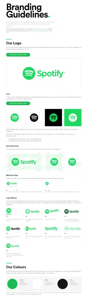
These guidelines are used to avoid inconsistencies in visual communication that might hurt brand identity, vision, value, strategy, and philosophy. The brand guidelines should be in a document that is shared with all the employees and teams, including the CRO team (or the marketing team, which performs CRO tasks). CRO campaigns that follow and stick with the brand guidelines will eventually strengthen brand credibility and identity.
For example, if the CRO team wants to tweak an image on the homepage, it needs to refer to the brand guidelines and check imagery specifications. If the proposed change falls within the guidelines, great. However, if an image violates imagery rules, the change must be revoked as it will hurt brand communication.
When hypotheses are developed and validated based on branding guidelines, your CRO campaigns will lead to brand credibility. Here are some practical techniques that your CRO team can use to improve brand credibility:
- Work together with the brand instead of working against it.
- Follow brand guidelines no matter what. Share it with all the team members.
- Use CRO techniques that are independent of brand guidelines such as site load time, customer feedback, social proof, etc.
- Ensure consistency.
- Focus on retaining customers as the golden rule is: 80 percent of your company’s future revenue will come from just 20 percent of your existing customers.
Pioneer and Create Unique Experiences
In the expanding marketing landscape, it’s challenging to stand out. Tailoring your content to a specific audience seeking precise solutions is essential. And transforming your website into a revenue hub requires delivering an unmatched experience.
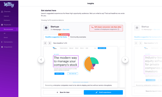
While it may seem daunting, user-friendly tools like Mutiny and Reactful empower you to revamp your site effortlessly, providing a distinctive online presence that resonates with your target audience.
Organic Content Mastery
It’s important that you elevate your online presence with high-quality organic content that captivates and retains your audience. Beyond conventional SEO practices, Neil Patel recommends incorporating fresh content. Track content performance to identify gems, repurposing them into various formats like videos and social media posts for a more expansive reach. Ditch the traditional 2,000-word quotas and focus on creating content that your audience will spend time consuming.
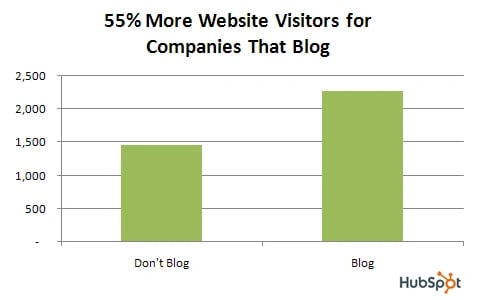
According to HubSpot, companies that blog get 55% more website visitors. By blogging once or twice a month, they have 67% more sales opportunities than companies that do not blog.
Social Proof Reinvention
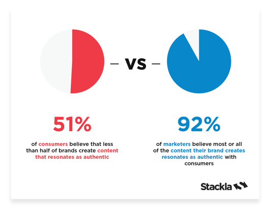
The year 2023 witnessed platforms shifting their focus towards creators, reflecting the changing dynamics of consumer trust. Leveraging user-generated content (UGC) to showcase your brand through the authentic lens of satisfied customers is a powerful strategy.
Encourage your community to share experiences and insights, fostering authenticity and trust. Go beyond the traditional company-centric approach to social proof by connecting reviews to real people. Highlighting your customers’ use cases in a meaningful way adds a personal touch that resonates with potential buyers. After all, 79% of people say UGC highly impacts their purchasing decisions.
Swap Out Your Images
You want to make sure your landing page images are compelling, on-brand, eye-catching and convey the proper message. The use of different imagery throughout your landing page design can affect conversion on your page. According to the Association for Psychological Science, there is a direct correlation between emotions and imagery. They found that emotions could be evoked and manipulated through the use of different photos. What emotion do you want the image on your landing page to evoke? For instance, sunshine evokes feelings of happiness and freedom, as do warm colors like orange. Dark colors can evoke foreboding, sadness and unhappiness, so use dark colors wisely. Learn how to manipulate your photos to portray the emotions you want your customers to feel.

It’s also important to use photography on your landing pages that feels genuine and on-brand. Since being genuine is associated with trust, you want to make sure your customers perceive you as honest and trustworthy. Oftentimes, generic stock photography can portray the opposite of those feelings. Instead of using a generic stock photo of a brunette girl with a customer service headset on, why not take a picture of your employees standing at the front desk with your shoppers, or an employee talking on the phone with a customer? Instead of a generic photo of a business person, include a picture of yourself on the landing page.
For instance, we did a photoshoot with our customer service team and one of our customers, CEV Consulting to use on our website. Check out the difference between that authentic photo
Compare a generic stock photo of a customer service rep:

To our authentic team + customer pic:

The more your landing page images feel true to your brand, the better your prospective leads will feel about giving you their business. Also, don’t discount taking photos with an iPhone or smartphone and doctoring them up in a photo editing program if you can’t afford a photographer. This type of scrappy work can result in beautiful, professional landing page images.
Finally, studies have shown that featuring humans in photography are more compellingthan logos, landscapes or other generic images. Facebook recommends using photos of real people in Facebook ads instead of illustrations or logos. Because of the positive, emotional connection with photos of individuals, it’s probably a good idea to include them within photos on your landing page. However, you can’t be absolutely sure what will resonate best with your audience until you A/B test photos with humans and without.
Test Button Colors & Calls To Action
You want your landing page visitors to click and convert, and the way they do so is through your call-to-action button. Don’t assume that the best button color for your landing page is a color that matches your brand. You want your button to stand out, and a contrasting color is likely best. Studies have shown that red buttons beat green buttons, but orange is best. Some brands have followed this advice, however, and seen opposite results. So the best thing to do for your business is to test different colored buttons to see which make your customers want to click.

You also shouldn’t default to “Submit” as your text on the button either. “Submit” is dull and doesn’t give the lead what they want. Try changing your call-to-action buttons to say something like:
- See Business Plans
- Start Your Free Trial
- Download My Free Guide
- Create My Free Account
All of the copy on these buttons have one thing in common—they’re speaking to what the lead is trying to obtain by clicking submit. Don’t overthink your button text because you can test and change it— “Get” is one of the most effective calls to action. Just remember to keep your call to action short and focused on what your prospective buyer will receive.
Finally, make sure your button isn’t competing with any other calls to action on your page. You don’t want three buttons inviting your customers to sign-up, see your testimonials and email you. Decide what you think is the MOST important action you want visitors to take, and make that button prominent and the only option.
Try Out Different Forms
You want your customers to fill out a form before they click submit, so you can gather lead intelligence that will help your email marketing campaigns or sales team. But what is the right length of fields on a form? Generally, the advice is not to include more than 5 – 7 pieces of collected information that a lead needs fill out.
Our resources page, for example, only asks for name and email address. For bottom-of-the-funnel leads who are requesting a demo, on the other hand, we ask for a bit more information as they are more invested in our solution.
However, much like the button color the best advice is to test what works best for your landing page visitors. Every target audience can exhibit different behaviors.
Another variable that matters on the form is the type of information you’re requesting. Leads might be willing to give their phone number, but not their email. They might balk at a question such as, “How often do you need financial assistance?” but be more willing to answer, “Would a loan be useful to you?” The way you word your form questions matters. Be sure to think carefully what types of information will help you segment your leads, and decide which are more sales qualified, then test out different versions of these questions.
As with all A/B tests, it’s important to isolate a variable you’re testing. If you’d like to test your button color, make sure nothing else is different about the landing page. Landing page variation A should look the same as landing page variation B, minus the one test you’re performing. This way you can be sure the test is accurately recording a lift in change.
Engage Your Audience with a Dominant Tool: Video
Videos provide a compelling means to convey your brand story, given the preference for video content on most platforms. The minimalist approach to video production can really show authenticity and transparency. From product demos to behind-the-scenes footage, the versatility of video types can enhance engagement. Most social media platforms have pivoted towards video, making it an effective way to connect with your audience.
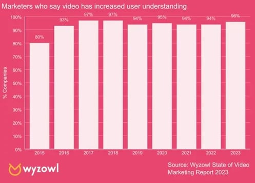
HubSpot reports that 96% of marketers say video has helped increase user understanding of their product or service.
Embracing Generative AI for Personalized Content
Artificial intelligence (AI) has taken center stage in 2024. AI tools can generate personalized content based on various factors, saving time and resources. Explore various AI tools to overcome creative obstacles and capitalize on the ongoing trend. If you haven’t explored AI tools, consider incorporating them into your work to streamline processes and enhance creativity.
In 2024, building a robust audience relationship is crucial. Embrace personalized experiences and innovative content to thrive. With the amount of tools and creative marketing ideas available, success is within reach. We eagerly await your insights and experiences, so share them with us on LinkedIn or Twitter!
If your brand is looking to make a splash in 2024, consider hiring a consultant to navigate you through your strategy and goals!
CRO Must Also Work with UX
User experience (UX) is focused on improving engagement such as time spent on a webpage, bounce rate, social shares, purchase frequency, etc. These metrics are more geared towards brand credibility as opposed to CRO techniques that simply focus on conversion (e.g., CTA button color, number of form fields, imagery, etc.).
CRO techniques that are focused on testing and improving UX deliver a more consistent brand image and don’t collide with brand guidelines. For example, if a blog post has low social shares, you can run an onsite survey to figure out why readers aren’t sharing this blog post. Or, you can compare the blog post with other posts with high social shares and see what’s missing.
This experiment doesn’t require any changes that are against brand guidelines. The same is the case with other UX optimization techniques.
Conversion rate optimization must start with UX optimization because it’s least likely to go against the brand. In fact, CRO needs to work together with all the marketing areas, not just UX. For example, understanding why a specific referral has a significantly low conversion rate and why different backlinks from the same domain have different conversion rates are also the domain of CRO.
Here is an overview of the CRO techniques to improve UX:
- Improve site load time.
- Use a responsive website design.
- Use white space to improve comprehension and to guide users to the important elements on your landing pages.
- Maintain consistency in design and layout.
- Improve navigation.
- Remove or fix 404 pages. Make them user-friendly.
- Minimize choices for users so they can quickly and conveniently make decisions.
- Improve readability and make content scannable.
- Use Google Analytics to improve engagement metrics.
A Client Example
We’re used to big clients with big goals, so when our client — a leading brand in the business formation industry — came to us with a big idea to increase revenue by 30% in 2023, we got to work on a plan. But, like most things, it wasn’t smooth sailing right off the bat.
The Problem: Traffic’s Up, Revenue’s Down
Over the previous year, we boosted the client’s web traffic by 25%, from 3.3M to 4.3M sessions. That included a 37% increase in organic search traffic and a 47% increase in new user organic sessions. But in spite of those successes, the conversion rate was lagging and revenue wasn’t reflecting the uptick in web visits.
It wasn’t all doom and gloom, though. Revenue was still up 23% YoY, but the increase just wasn’t in line with the results we saw from traffic. We knew we could do better.
The Fix: Our Process for Improving Conversions
We realized that if we could improve the conversion rate on targeted high-performing pages, we’d see the impact we wanted. After some careful strategic planning, we opted for a two-pronged approach: short-term wins gained by delivering unique micro experiences tailored to user behavior, combined with long-term systemic improvements based on the data collected.
In the here and now, the solution that eventually rose to the top was Pathmonk, an AI data analysis tool. We committed to a three-month experiment and set the following parameters:
- Analyze 12 of the client’s most impactful pages with the highest combined traffic and sessions.
- Grant Pathmonk access to those pages and the site for one week to gather data on user behavior.
- Provide Pathmonk with a variety of marketing assets (micro experiences) curated for different positions in the buyer’s journey.
- Review and track progress in order to make adjustments to micro experiences as needed.
With the insights gathered by Pathmonk during their week-long analysis, we were able to deliver a range of micro experiences that suited the stages of the buyer’s journey. Pathmonk’s AI determined the stage and then served up a custom experience based on the user’s actions. For instance, at the awareness stage, users were shown a welcome video, while those in the consideration stage received a micro experience that dug deeper via a “How it Works” page. At the bottom of the funnel, visitors received a micro experience that urged them to place an order.
Buyer’s Journey Insights
One non-tangible but extremely valuable benefit from our Pathmonk experiment was the insights and data it delivered on our buyer’s journey. We learned where most users went from the home page, the path they took, and where they ultimately ended up.
We also learned that most of our visitors were in the awareness stage of the journey. While they made up the majority, they were also the least likely to engage with one of our micro experiences. While we had a much lower percentage of visitors in the decision stage, they were over three times as likely to see and engage with a micro experience. At this point in the journey, the visitors who are ready to make a purchase decision are much more open to taking the desired action on the site.
Armed with this information, we were able to adjust the micro experiences that leveraged the user’s stage in the buyer’s journey and presented CTAs that were appropriate to where they were and what their needs were. In this way, we paved a path to conversion that made sense for the user.
Results: Month One
It didn’t take long to see the difference made by zeroing in on conversion rate improvement. In just four weeks of having the micro experiences live on the targeted pages, we saw 302K visits (35% of total site traffic), and then, the headline-making numbers: $1.5M in influenced revenue, 7,666 orders placed from the experiment group (micro experiences drove 3,958 of those orders), and a 58% improvement in conversion rate, from 1.6% baseline to 2.53% on targeted pages.
ROI was also off the charts (quite literally). The monthly cost for Pathmonk was $1,900, which is nothing to sneeze at, but when you compare that to the $236,293 in sales generated directly from Pathmonk, you get an ROI of 12,436%. That’s JUST for the orders placed via the micro experiences and doesn’t reflect the total $1.5M revenue influenced by the website improvements — meaning the actual ROI is most likely even higher.
Next Steps
Our three-month experiment is still ongoing, and we’re thrilled with the results so far — but we know there’s more work to do. Ahead, we’ll take a closer look at our micro experiences to glean which are the most effective so we’re able to focus our efforts on maximizing their impact.
We’ll use heatmaps to discover where visitors are when they’re served a micro experience and analyze their actions to learn more about them. We also feel confident that the insights we gather from this experiment will be transferable to the website as a whole and can be used to improve the experience for all visitors.
Ultimately, when you know your traffic is booming and you’ve got eyes on your site, but your sales just can’t keep up — you’ve got a problem. Taking a closer look at your conversion rate and looking at ways to improve is a quick and efficient step toward rectifying the issue, and Pathmonk is a tool we highly recommend to achieve those goals.
CRO or Brand: Who Wins?
Both.
The brand should guide CRO because this is the best approach to website optimization without losing what your brand stands for.. When the CRO fails a brand, it has lost sight of brand guidelines. All the market players — from CRO and lead generation to content and SEO — should work together for brand growth so that a consistent message is communicated throughout the funnel and across all marketing channels and customer touchpoints.
In a war between brand and CRO, both will lose eventually. Both should join hands and work together and compete against competitors.


